Good Graph on Two Economic Recoveries
Chart from Heritage Foundation. Thanks to Goldwater Institute for pointing it out.

Chart from Heritage Foundation. Thanks to Goldwater Institute for pointing it out.
In my previous post, I used a graph to illustrate how state spending in Arizona hasn’t been cut enough, not only compared to actual revenue collections, but based on what prognosticators thought revenues would be. The point of my graph was to show how spending consistently outpaced revenues and to illustrate why the deficit in AZ ($1.7 billion) is as big as it is (even though spending has been reduced somewhat).
Paul Krugman, who runs Conscience of a Liberal blog for the NY Times, uses this graph to show that the reason the federal budget deficit is so large is not because federal spending has exploded, but because revenues collapsed.
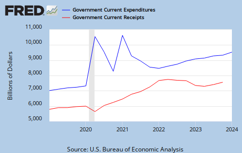
Ok, great. Federal spending (blue line) continued to outpace revenues (red line) when times were good, and now that times are bad, federal spending only continued to grow as if the economy was humming along just fine.
The deficit would be far worse if Krugman had his way (which he admits). He has argued for a year that the Bush/Obama response to the economic meltdown was way too little and way too late. He continues to argue for lots more spending to get the economy moving again.
I suppose there’s some silver lining that the blue and red lines can be viewed on the same screen.
There are many line items in the state budget, both on revenue side and the expenditure side. As a matter of practice, when looking at the budgets from fiscal year to fiscal year, we like to look at net ongoing revenue vs. the appropriated operating budget.
Net ongoing revenue is the most conservative estimate for what state government can reasonably count on having. It doesn’t count any one-time revenues like carry-forward balances, fund-transfers, agency sweeps, sale lease-backs, and other one time revenue gimmicks. Similarly, the appropriated operating budget includes the vast majority of ongoing government expenditures. It doesn’t count supplemental spending, adjustments, repaying government transfers, litigation payments, or other one-time expenditures.
What we see from fiscal years 2006 through 2011 is not just disturbing, but it explains how Arizona policymakers have saddled Arizona taxpayers with nearly a near $2 billion budget deficit, and increases in both sales and property taxes. As revenues exploded, government spending did its best to catch up.
Growth in government spending should be limited since the bigger government gets, the more it crowds out private sector investment. Arizona now spends over $250 million a year just on debt service alone. That’s money that could be better used somewhere else.
What this graph shows most vividly is that Arizona needs real spending restraints. These spending figures were adopted (meaning voted on and signed by the governor). Adjustments were made, but lawmakers essentially adopted budgets they knew they couldn’t reasonably cover. A spending limit would not have prevented the near 40% decline in revenues Arizona has experienced, but it would have mitigated the size of the deficits, curbed our growing debt, and certainly would have prevented the three-year, $3.75 billion hike in sales and property taxes.
Click image for larger view.

From the AZ Democratic Party:
Poll by respected researcher Bruce Merrill indicates tighter governors race than right-wing Rasmussen polls. http://ow.ly/2QQAE
First, Bruce Merrill might be a respected person, friend, father, neighbor . . . but in political circles, he’s not a respected pollster.
Second, Merrill’s survey was paid for by Goddard’s campaign. Now, that doesn’t make the numbers wrong, but since Brewer isn’t paying for Rasmussen’s polls (which show her leading by 16 points), it kind of lets the air out of the balloon.
Third, adding insult to injury, the Oct. 5 NY Times model has Brewer up 15%. No, not the right-wing NY Times . . . the real one.
** Update ** The October 7 model in the Manchin (D) vs. Raese (R) WV Senate race has Raese with a 64% probability of winning. The Sept. 30 model, which I wrote about below had it the other way around. If you’re a betting man, and you like to bet on the favorites, you’d vote for Raese (if the election were held today, of course).
——
Karl Rove and Company have produced an interesting map of 2010 Senate races. Rove says that if the election were held today, Democrats will lose 10 seats (down to 49), Republicans will gain six (up to 47) and four toss-ups.
Interested in those four toss-ups, I checked out Nate Silver’s FiveThirtyEight.com blog (hosted on the NYT website) run by Nate Silver (great website and great writing). FiveThirtyEight averages a variety of surveys conducted in House, Senate, and governors races across the country, but they also calculate the likelihood that a particular candidate will win his race*. For example, Arizona governor Jan Brewer has a 98 percent chance of defeating Terry Goddard (Brewer is up by 15%). Doesn’t mean Brewer’s certainly going to win by 15%, but it does mean that she’s almost certainly going to win.
So, let’s take a look at the four Senate toss-ups:
Washington:
Patty Murray (D) is up 50% – 47% over Dino Rossi (R) and has a 74% chance of winning.
Nevada:
Harry Reid (D) and Sharon Angle (R) are statistically tied at 48% each. However, Angle has a 55% chance of winning.
Illinois:
Alexi Giannoulias (D) and Mark Kirk (R) are about even (Kirk’s up 49%-48%), but Kirk has a 54% chance of winning.
West Virginia:
Joe Manchin (D) is barely beating John Raese (R), 50%-48%, but Manchin’s chances of getting elected are 63% to Raese’s 37%.
What to make of all this? Today, it looks like the Dems will retain the majority in the U.S. Senate by the slimmest of margins, 51-49.
* What Silver’s chance of winning percentage means: The chance that each candidate will win based on 100,000 simulations with random variation in the local and national political environment.
We will continue to track these four races and other key races around the country.
Recent Comments